This guide explains a new functionality that allows you as admin to view your platform data graphically.
PLEASE NOTE: If you’re on a Grow or Scale plan, we’ll set up everything for you, and provide a free DataBox account to get full access to their graph functionality.
Video Guide
Written Guide
Step 1: Download and Prepare your Data Source
In your admin dashboard, download your Users and Jobs csv files:

Open the CSV on your computer and delete any columns containing personal data that you don’t want to use, or is against your User Privacy Policy or Data Protection Agreement, and save the file.
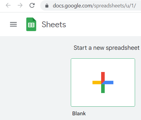
Create a new Google Sheet:
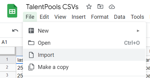
Import the CSV files into new Worksheets, within the same Sheet:
Create a new column on the far right, and add the number ‘1’ into every row, for example:
| Job Name | Description | Number |
| Software Developer | You need to be able to code well, in any FE language. | 1 |
| Some other job name A | Some other job description. | 1 |
| Some other job name B | Some other job description. | 1 |
| Some other job name C | Some other job description. | 1 |
| Some other job name D | Some other job description. | 1 |
Delete the original csv download.
Step 2: Create Metrics
Login or register at Databox.com, or any other data visualisation tool. Head over to the Query Builder and add a new metric:

Select your Data Source:
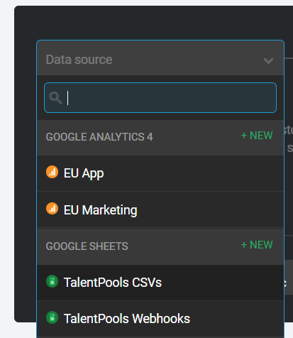
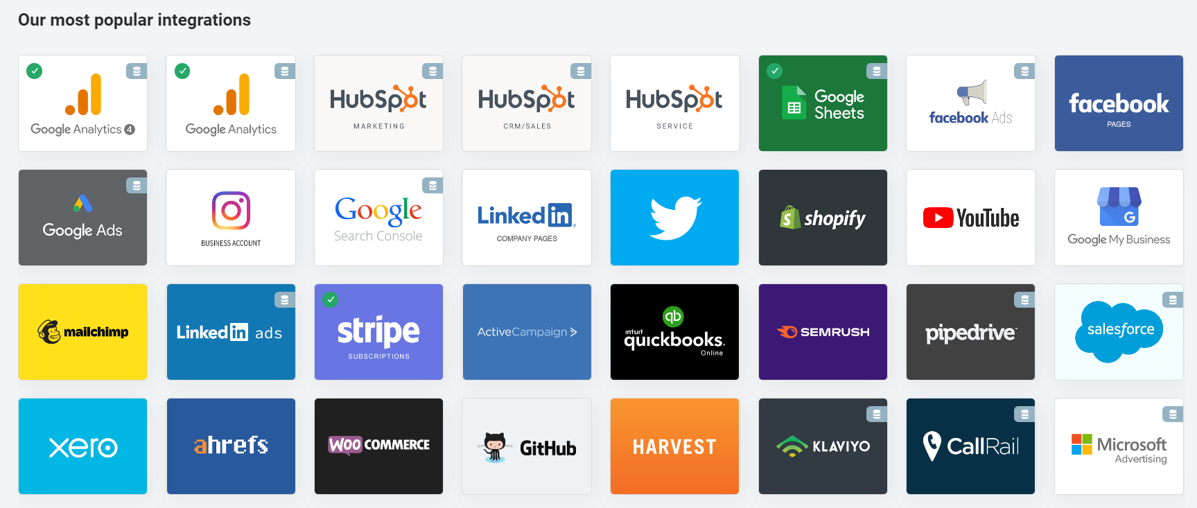
For now, we’ll use your Google Sheet, but you can also use hundreds of other apps including Google Analytics, Intercom, Stripe etc:
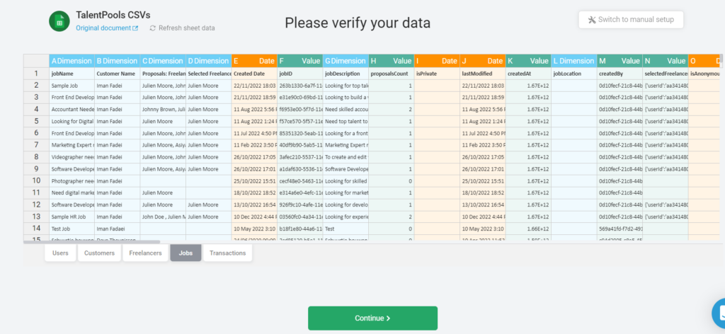
Choose your worksheet:
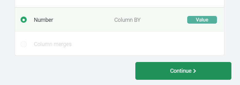
In the ‘Select the Value’ step, scroll to the bottom and select the ‘Number’ column that you recently created within Google Sheets:
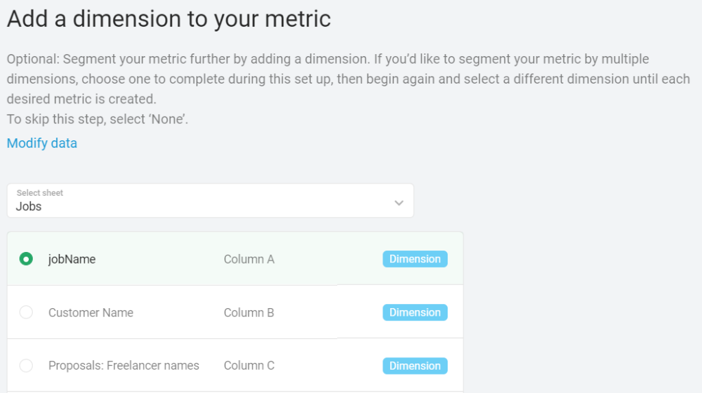
If you like, choose an optional dimension to display. For example, you could select Job Category, or Freelancer Type, or other variable you want to view:
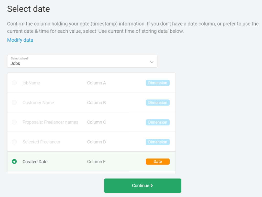
Select the relevant data. In most cases I would suggest the ‘createDate’ or ‘registerDate’:
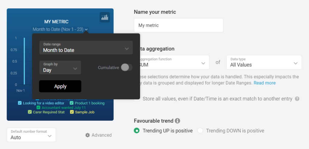
You can now customise the metric by renaming it, and changing the date range:
Step 3: Add Metrics to your Databoard
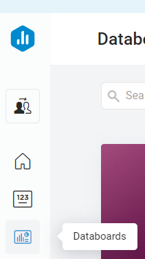
Create a new Databoard and choose ‘Start Blank’:

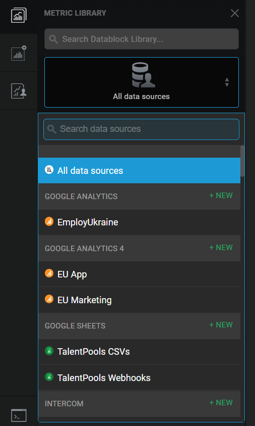
Choose your DataSource:
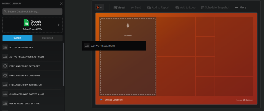
Choose a metric and drag in into the Databoard:
You can resize the metric within the Databoard:
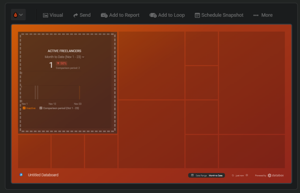
If you click on the metric, a box will slide in from the right to display additional customisation options for that metric:
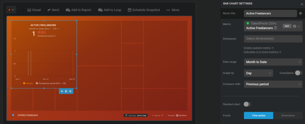
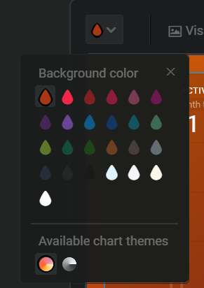
You can change the design of the Databoard on the top left button:
When you’re happy with your Databoard, click the ‘Send’ button at the top:

Then click ‘Embed’ and copy the code displayed:
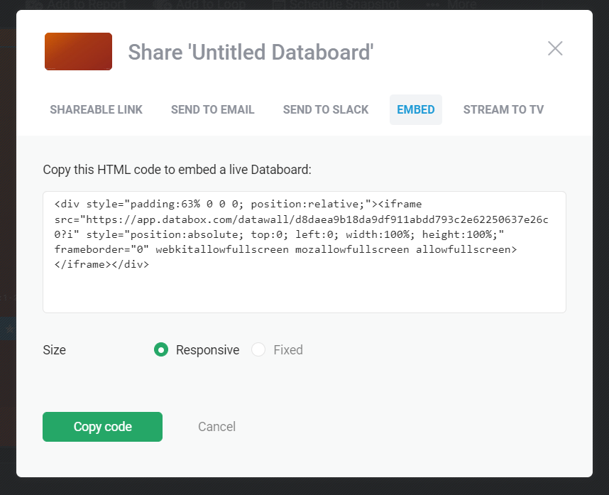
Step 4 – Display the Databoard on your Admin Dashboard
Go to your Styling tab, and you’ll notice a few new sections:
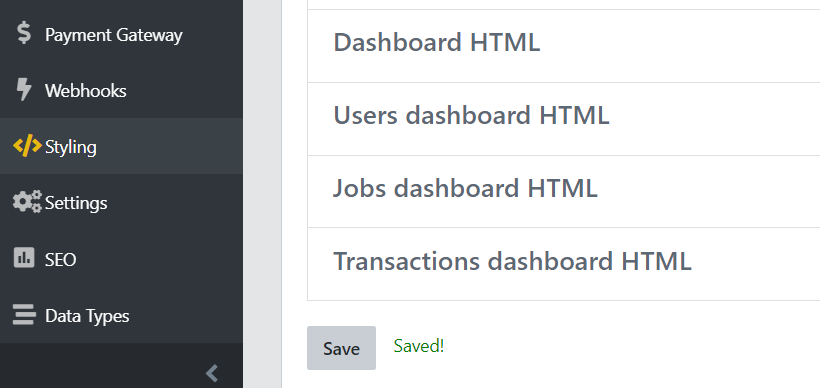
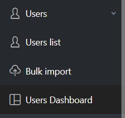
These sections represent new tabs added to the Admin Dashboard. For example, there’s now a new User Dashboard:
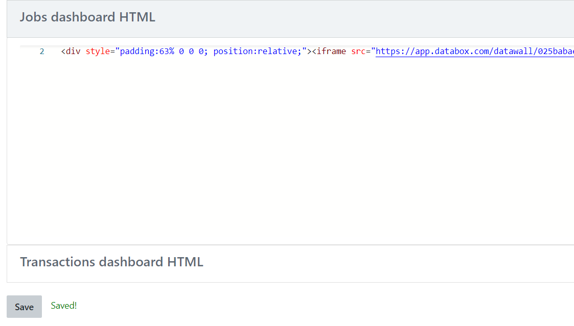
On the Styling tab, you can click on any section and add any Databoard (or other embedable content) to those new tabs. Just paste in the embed code you copied from the Databox Databoard, and click Save at the bottom of the page:
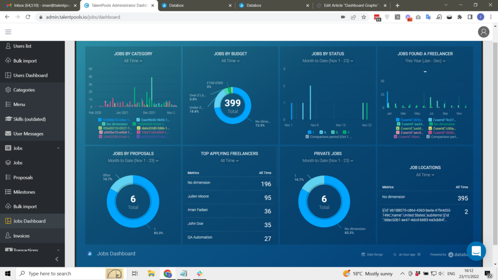
Congratulations, your Databoard should now be displayed on that Tab:
Get in touch with any questions!