This guide walks through a new customization that can be chosen for the milestone section of a contract.
Video Guide
Step by Step Guide
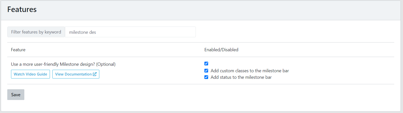
In your admin dashboard under the ‘Settings’ menu item is the option to ‘Use a more user-friendly Milestone design?’
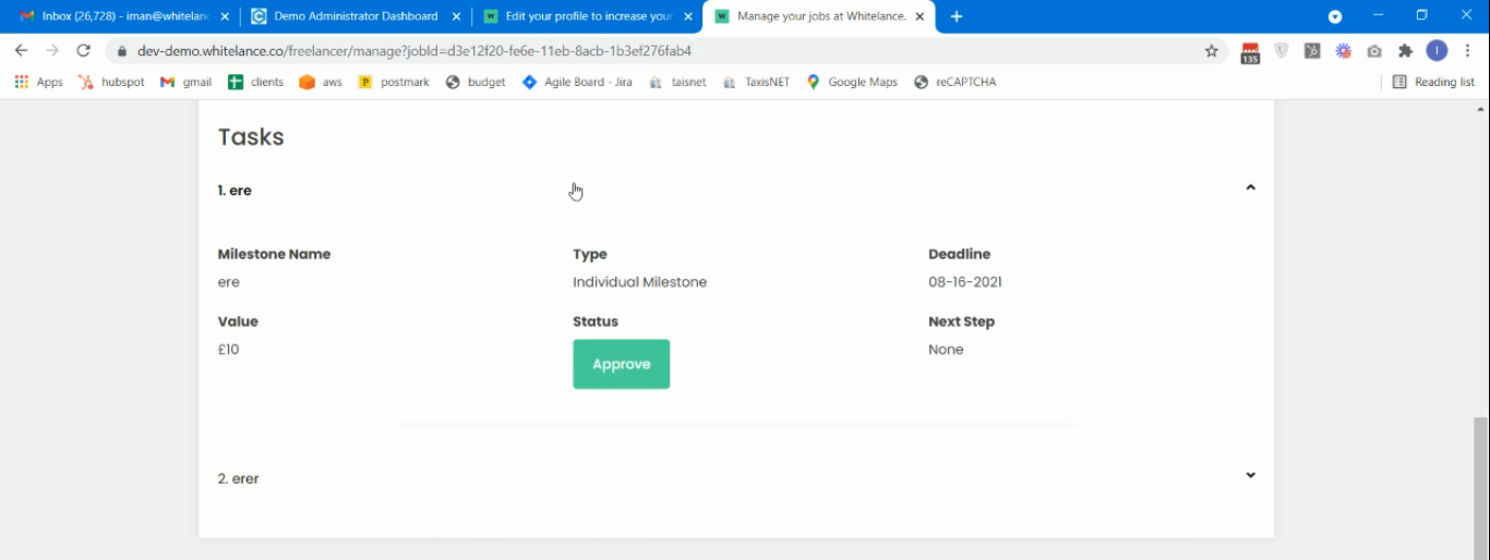
When this option is not enabled, the milestones on the contract page will appear as shown in the image below. Milestone 1 has been selected, revealing the milestone details. The hover state is bold text.
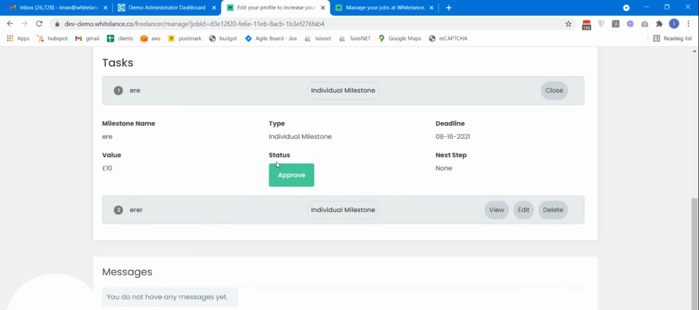
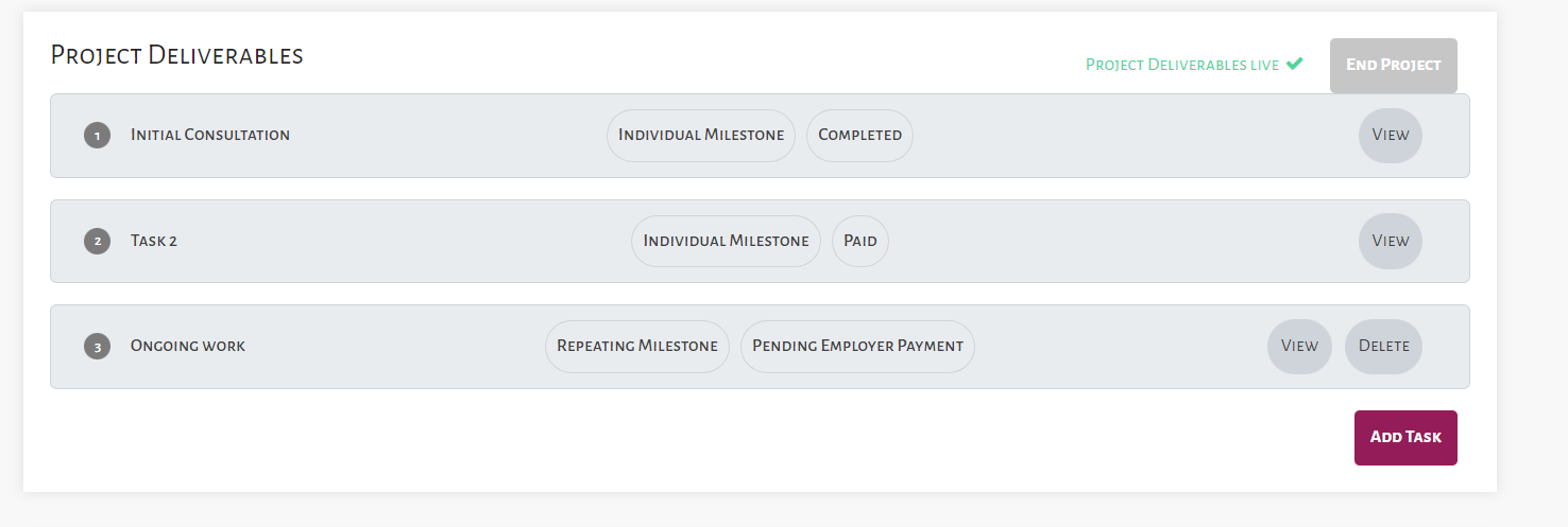
When this feature is enabled the appearance will change as shown below. Each milestone is highlighted in a coloured block, the type of milestone is visible on the label, and when a milestone is selected the relevant details appear.
This new milestone section’s appearance can be changed completely at the ‘styling’ section of the admin dashboard by scrolling to (or searching for) ‘Milestones’.
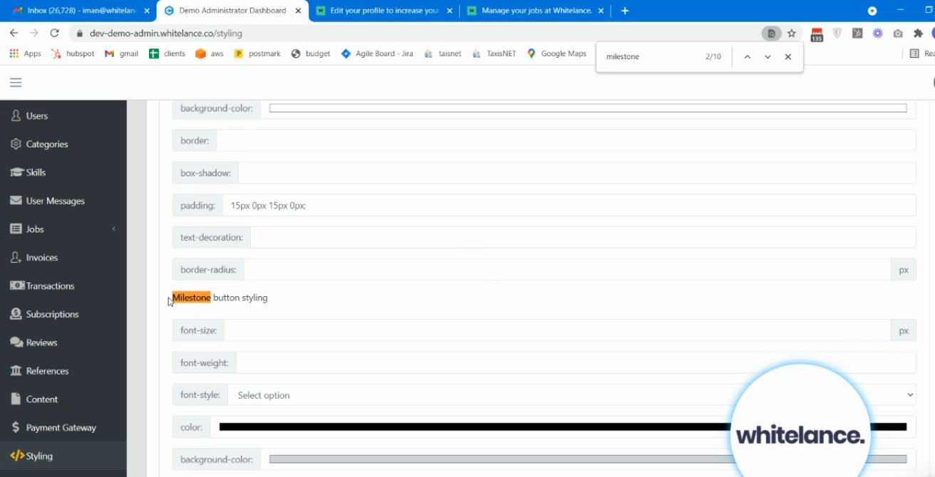
In this section the appearance of the buttons, block background and label can all be customised.
Each button has three states: regular, hover (when mouse is hovering over it) and active (when it is clicked)- the colour of each can be changed, as can the font, text and borders.
The ‘Milestone collapse styling’ refers to the block each milestone is presented in (light grey in the example above).
The ‘Milestone label styling’ refers to the label in the centre of the block, which in the example above reads ‘Individual Milestone’.
Enabling the subfeature to ‘Add status to the milestone bar‘, will display the milestone’s status in the milestone preview bar, as shown in the image below.
Enabling the other subfeature to ‘Add custom classes to the milestone bar’, allows the admin to configure the appearance of the milestone’s status bar using custom CSS depending on the milestone status. In this way, depending on whether the milestone is pending payment, is pending approval or is completed the milestone bar could have a different color to reflect this status. More information on using CSS in this guide.