This guide presents an alternative layout for the ‘Search Freelancers page’ for online marketplaces powered by TalentPools’s technology solution.
Video Guide
Step by Step Guide
The alternative display is activated on your admin dashboard under ‘Settings’ and by selecting ‘Display an alternative design on the Search Freelancers page?’

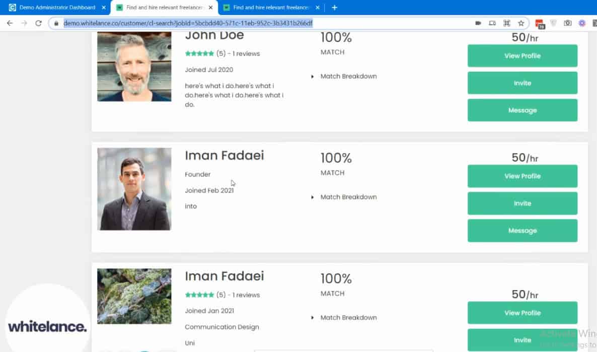
The original design of the search freelancers page has square images, the text is larger, and the block for each freelancer is a different size depending on the number of items they have included in their profile.

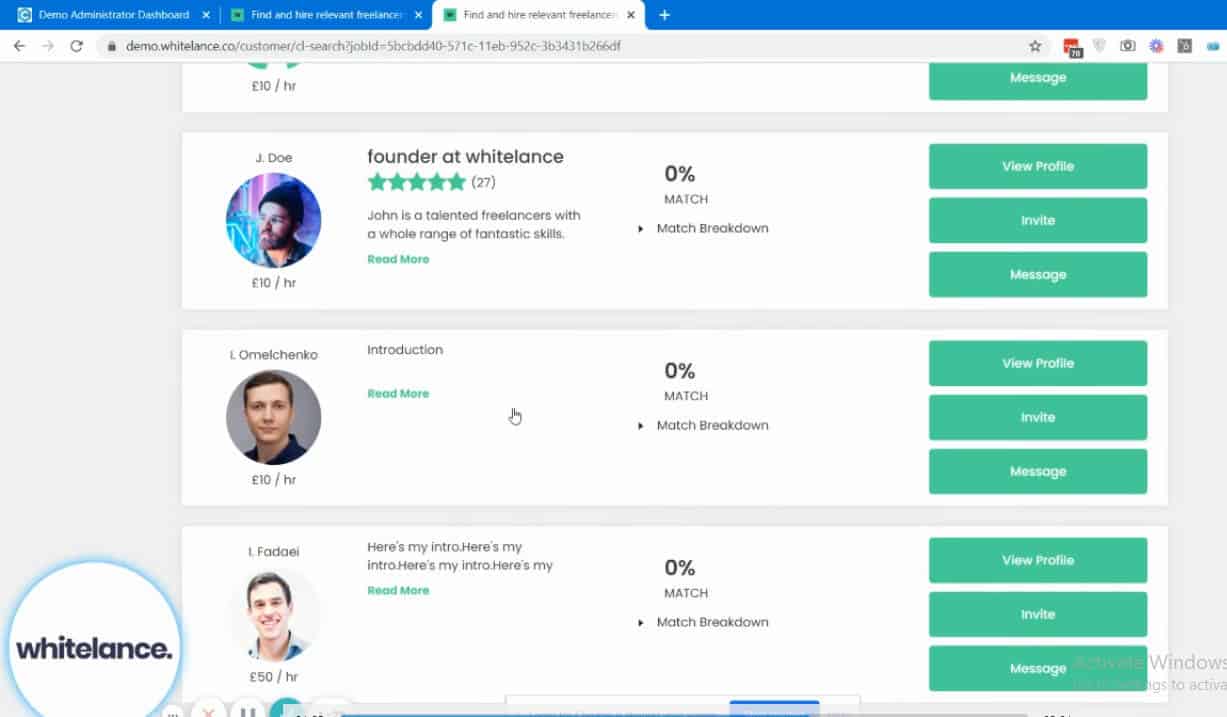
To create a better and more aesthetic user experience this page was redesigned to have round images with the name above and hourly rate below the image, and for each block to be a similar size as shown below.
